
If every student in a class aces an assessment, does that mean the teacher did an exceptional job?
This exact question sat at the center of our internal debate as we worked to measure teaching effectiveness across hundreds of concurrent cohorts—and ultimately decide where to deploy our limited coaching resources for maximum impact.
Our goal is operational excellence at scale. However, we recognize that linking (or the suggestion of linking) teacher performance directly to student assessment data is notoriously tricky. Globally, most education systems evaluate teachers mainly through input measures, such as classroom observations and professional portfolios. Even in places that do incorporate student outcomes—such as Singapore, Chile, and select US school districts—the practice faces friction.
We knew early on that using assessment data at scale required extreme caution. Initially, in the spirit of providing open data for teachers’ self-evaluation, simply sharing a cohort’s performance alongside section averages triggered unintended behaviours: a number of instructors began dropping obvious hints before tests, and teaching strictly to the assessment rather than fostering deep understanding. Visibility alone drives behaviour. Unless we actively reinforce the data’s true purpose, short-term test-prep will normalize—evaluation or not.
Yet, to ensure every student receives an equal opportunity to master core concepts, standardized assessment data remains our most reliable signal. It measures the primary output of the learning process. Without output data, process improvement happens in the dark, making it impossible for teaching standards to evolve systematically over time.
This brings us to our central challenge: How do we use student assessment data to drive teaching quality without incentivizing shortcuts that compromise true learning?
A higher class average doesn't always equal better teaching.
A single-number threshold like a class average is deceptively easy to game—intentionally or not.
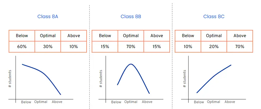
When we plotted individual score distributions of our standardized formative assessments across our cohorts, the visual shape of the curve immediately revealed what was happening inside the classroom:
The Artificial Spike (J-Curve) – Class 8C: Unusually high class averages were often driven by a steep upward curve, with nearly every student scoring above 85%. While a natural assumption might be exceptional teaching, this pattern rarely reflects genuine mastery. Instead, it typically points to one of two issues: either the assessment itself was far too easy, or the instructor engaged in spoon-feeding and test-prep shortcuts.
The Critical Deficit (Downward Curve) – Class 8A: A right-skewed curve where most students failed correlated strongly with lower classroom observation scores. Crucially, when this pattern appeared across multiple classes, it pointed to fundamental flaws in our own pedagogy rather than individual teacher performance.
The Sweet Spot (Bell Curve) – Class 8B: Across every high-performing cohort—measured by our input standards—student scores naturally formed a standard bell curve, regardless of where the specific average landed.
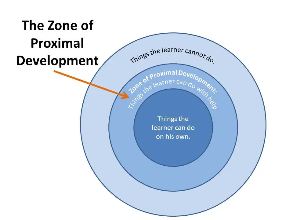
Interestingly, artificially inflated scores didn’t keep students happy. Cohorts with continual steep upward curves saw a drop in attendance and program retention. Students want to be challenged—a real-world manifestation of Vygotsky’s Zone of Proximal Development. When learning feels too easy, engagement falls off.
Towards a more targetted intervention, a case for more effective use of coaching and observations
By shifting our focus from raw averages to curve distribution, we transformed how instructional leaders monitor teaching quality across hundreds of concurrent cohorts. Instead of attempting exhaustive, low-yield classroom observations everywhere, leaders now use distribution shapes as a triage system. Anomalies—like artificial J-curves—flag immediate coaching needs, allowing us to deploy limited support resources with surgical precision.
When a cohort exhibits a classic bell curve with below-average scores, it doesn’t trigger punitive action. While we explicitly avoid using assessment data as a direct evaluation metric, these low-average bell curves serve as a reliable diagnostic signal. They tell instructional leaders exactly where to observe, turning random check-ins into targeted, high-impact mentoring sessions focused on shifting that baseline upward over time.
Ultimately, long-term improvement requires moving the entire curve to the right—raising average mastery without distorting the distribution. Achieving this demands a profound cultural shift. When teachers view data not as a weapon for evaluation, but as a compass for support, trust replaces anxiety. Transparent communication ensures everyone understands the goal: building a system where data serves teaching, not the other way around.